|
|
Color Boards are a way for interior designers to create a color palette when in need for inspiration to redesign a home or room.
There are many different types of color boards that one can do, there is no wrong answer to creating a color board because it is based off of what you and the client have discussed, or you can make one on your own. This is a method that brings those creative thoughts to real life before going straight into purchasing items which we may decide against as the room comes together. This can be done online by copy and pasting looks you like, or you can make a board that includes real life samples so you are able to touch and feel.
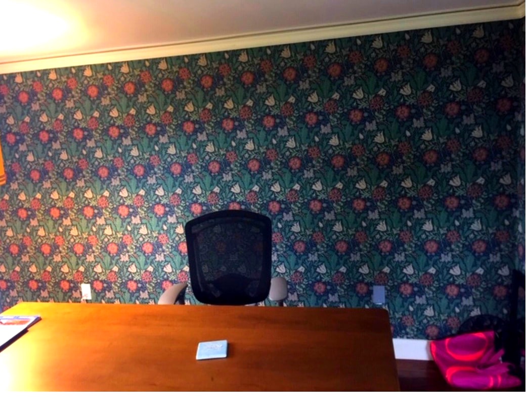
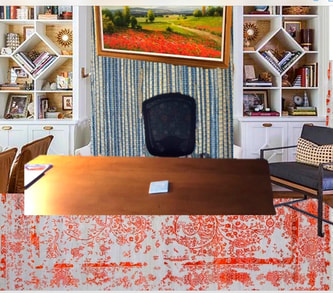
Currently one of our clients is looking to change the decor in three different rooms and re-decorate their fire place. One of the rooms is the husband's office. As you can see above, on the left side is what the office currently looks like, on the right side is the color board me and Mrs. Pierce came up with to show the client. The room needed to be modernized, it had an old fashion feel to it.
We decided we wanted to brighten the room up with a colorful carpet and changing the wallpaper to something more modern like this grass feel wallpaper shown in the color board above. The office did not have cabinets to store work and other utilities, so we knew we had to add some cabin space. There is a lot of wall space so we decided to build unique cabinets and add a vibrant painting to tie the rug in so there is a balance within the room. Just with these few changes, it brought the room an entire different essence.
There are many different types of color boards that one can do, there is no wrong answer to creating a color board because it is based off of what you and the client have discussed, or you can make one on your own. This is a method that brings those creative thoughts to real life before going straight into purchasing items which we may decide against as the room comes together. This can be done online by copy and pasting looks you like, or you can make a board that includes real life samples so you are able to touch and feel.
Currently one of our clients is looking to change the decor in three different rooms and re-decorate their fire place. One of the rooms is the husband's office. As you can see above, on the left side is what the office currently looks like, on the right side is the color board me and Mrs. Pierce came up with to show the client. The room needed to be modernized, it had an old fashion feel to it.
We decided we wanted to brighten the room up with a colorful carpet and changing the wallpaper to something more modern like this grass feel wallpaper shown in the color board above. The office did not have cabinets to store work and other utilities, so we knew we had to add some cabin space. There is a lot of wall space so we decided to build unique cabinets and add a vibrant painting to tie the rug in so there is a balance within the room. Just with these few changes, it brought the room an entire different essence.
|
|
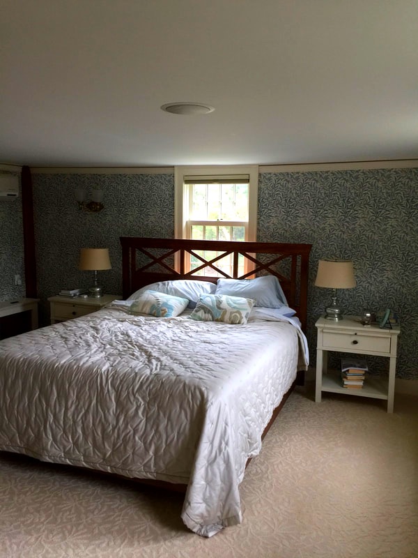
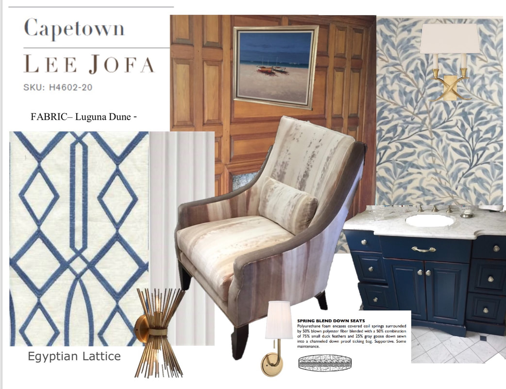
The same client also wanted to re-do the master bedroom which included a room and master bath. We combined a color board for both rooms because it is important to keep the balance and flow for the connecting rooms. She knew she wanted to keep the wallpaper in the bathroom which is located in the picture on the right top corner. Since this house was built in the 1700's, the light fixtures were not enough to brighten the room and gave it an old fashion feeling. We decided on adding two different fixtures located on the color board, The bottom one is for the bedroom and the other fixture is located in the bathroom.
The dark wallpaper and tan rug in the bedroom did not help bring in any light because both we're from a dark color scheme. We decided to paint the walls a shade of white called "Simply White" by Benjamin Moore. The rug located on the left side of the color board is what we decided would be best to tie the blue and white between both rooms which will also make the bedroom have a lighter, more nautical feel.
The dark wallpaper and tan rug in the bedroom did not help bring in any light because both we're from a dark color scheme. We decided to paint the walls a shade of white called "Simply White" by Benjamin Moore. The rug located on the left side of the color board is what we decided would be best to tie the blue and white between both rooms which will also make the bedroom have a lighter, more nautical feel.
|
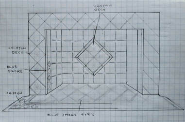
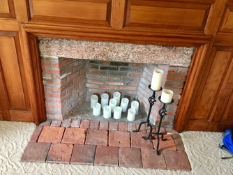
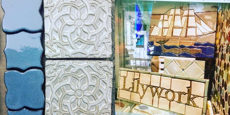
Since this house was built in the 1700's, the fire place that came with the home was outdated. This house is located on the water so we wanted to stick with the nautical theme that we went with in the other bedrooms. We decided to work with Lilywork which is a tiling company. We drew up a sketch of the fire place to represent what it would look like with the tiles we chose which are located in the bottom left photo. We needed to know how many tiles we would need and the placement of the two different tiles we chose.
|
